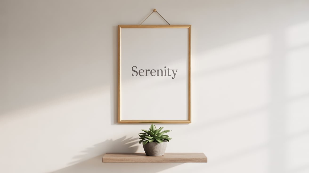
Minimalist wall art transforms blank walls into purposeful design statements without overwhelming your space. The beauty of this approach lies in its simplicity – clean lines, thoughtful composition, and intentional restraint create rooms that feel both sophisticated and calming. Rather than filling every inch of wall space with decoration, this style celebrates the power of selective choices that make maximum visual impact through minimal means.
The versatility of minimalist wall art makes it perfect for any room in your home, regardless of existing decor or architectural style. Whether you’re working with a cozy apartment or spacious house, these pieces adapt beautifully to various settings. From abstract line drawings to geometric prints, monochromatic photography to simple typography, the options suit diverse tastes while maintaining that essential simplicity that defines the aesthetic.
Finding the right minimalist pieces for your walls involves understanding scale, color relationships, and the unique needs of each room. The following sections will guide you through selecting art that complements your spaces, placement strategies that create visual harmony, and practical tips for building a cohesive collection without breaking your budget. Ready to discover how less truly becomes more on your walls?
What Makes Wall Art Truly Minimalist
The essence of minimalist wall art goes beyond simply choosing pieces with fewer details. This design philosophy centers on intentional simplicity, where every element serves a purpose and nothing feels superfluous. Understanding these core principles helps you identify authentic minimalist pieces that will enhance rather than clutter your spaces.
Clean Lines and Simple Forms
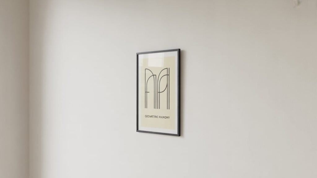
Geometric shapes dominate the minimalist art world for good reason. Circles, squares, triangles, and abstract linear compositions create visual interest through their pure forms rather than complex imagery. These pieces work particularly well because they complement architectural elements already present in your rooms – the straight lines of doorways, the curves of archways, or the angles where walls meet ceilings.
Line art has become increasingly popular in minimalist interiors. Single continuous lines that form faces, bodies, or abstract shapes demonstrate how powerful simplicity can be. These pieces often feature just one color against a neutral background, proving that artistic impact doesn’t require elaborate detail or multiple hues.
Neutral Color Palettes
The color choices in minimalist art typically stay within a restricted range. Black, white, gray, beige, and soft earth tones dominate, though this doesn’t mean boring or lifeless. These neutral foundations create calm environments while allowing other room elements to shine. The restrained palette also ensures your art won’t clash with changing decor over time.
Monochromatic approaches take this concept further by using various shades of a single color. A piece featuring different gray tones, for instance, adds depth and sophistication without introducing competing hues. This technique creates subtle visual texture that draws the eye without demanding attention.
Negative Space as Design Element
Perhaps no aspect defines minimalist art more than the strategic use of empty space. What isn’t there matters as much as what is. Large areas of blank canvas or paper around a small central element create breathing room that prevents visual overwhelm. This negative space isn’t wasted – it’s an active component of the composition.
Artists working in this style understand that emptiness creates emphasis. A small black circle on a vast white background becomes more powerful than if surrounded by other elements. Your eye naturally focuses on the singular detail, appreciating its form without distraction.
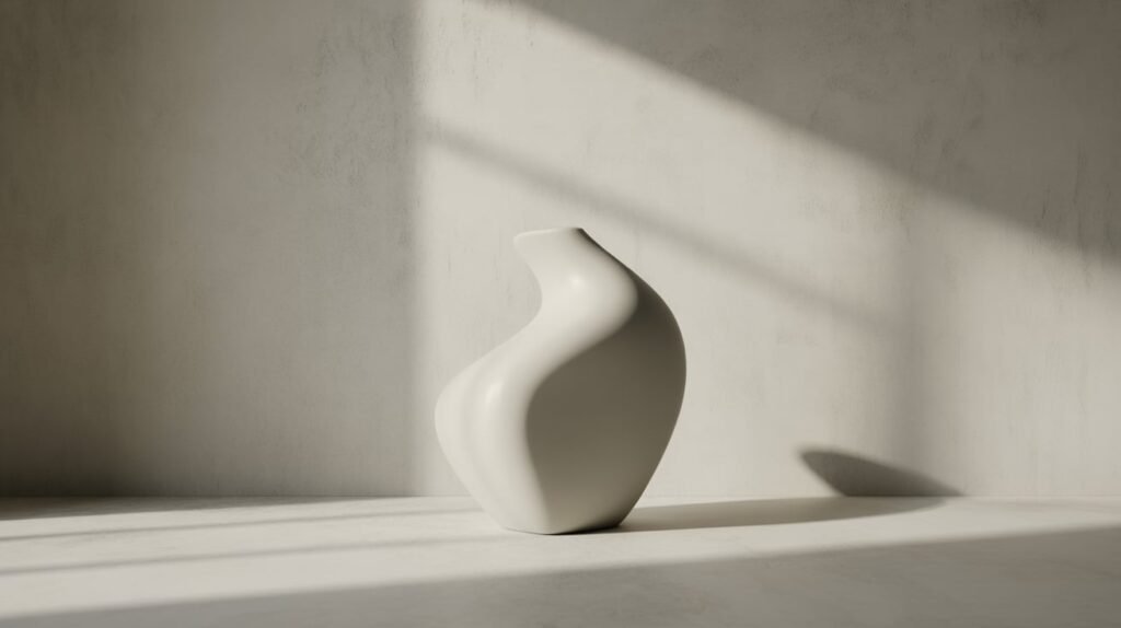
Material Choices for Minimalist Art
The materials used in minimalist pieces contribute significantly to their overall aesthetic. Smooth surfaces, clean edges, and quality finishes reinforce the style’s refined nature. Paper prints in simple frames, canvas with clean gallery wraps, or metal prints with their sleek finish all work beautifully.
Natural materials also align well with minimalist principles. Wood frames in light, unstained finishes or simple black metal frames avoid ornate details that would compete with the artwork itself. The frame should support, not dominate, becoming almost invisible in service of the art.
Scale and Proportion Considerations
Size matters tremendously in minimalist art selection. A single large piece often makes more impact than several smaller ones, embodying the “less is more” philosophy. Oversized art creates dramatic focal points while maintaining the clean, uncluttered aesthetic central to this style.
Proportion relates not just to wall size but to surrounding furniture and architectural features. A piece that’s too small gets lost, while something too large overwhelms. The sweet spot typically involves art that occupies about two-thirds to three-quarters of the wall space above a sofa or fills a reasonable portion of an empty wall without crowding it.
How to Choose the Right Size and Placement
Getting proportions right transforms minimalist art from simple decoration into powerful design elements. The relationship between your art and its surroundings determines whether a piece enhances or disrupts your room’s flow. Strategic placement decisions based on room dimensions and furniture arrangements create the visual harmony that minimalist design celebrates.
Wall Measurement Guidelines
Start by measuring your available wall space accurately. For walls above furniture, aim for artwork that spans 50-75% of the furniture’s width. This creates a balanced look that feels intentional rather than random. Above a six-foot sofa, for example, consider art that’s three to four and a half feet wide.
Empty walls offer more flexibility but still require thoughtful scaling. Large blank walls can handle substantial pieces – think 40 inches or wider – while smaller walls between windows or in hallways suit more modest dimensions. The key lies in leaving adequate breathing room around your art. At least 6-10 inches of empty space on all sides prevents that cramped feeling.
When working with multiple pieces, treat them as one unit for measuring purposes. The combined width and height of your arrangement should follow the same proportional guidelines as a single piece. This approach maintains visual cohesion even with gallery wall arrangements.
Creating Visual Balance
Balance in minimalist design doesn’t always mean symmetry. While centered placement above furniture creates classic harmony, asymmetrical arrangements can feel equally resolved when done thoughtfully. Offset placement might work wonderfully if balanced by another design element – perhaps a floor lamp or tall plant on the opposite side.
Consider the visual weight of your pieces beyond just their physical dimensions:
- Dark Colors: Create more visual weight than light ones
- Thick Frames: Add substantial presence compared to frameless pieces
- Bold Patterns: Command more attention than subtle designs
- Textured Surfaces: Draw the eye more than smooth ones
Understanding these weight principles helps you create arrangements that feel stable and intentional. A large pale watercolor might balance perfectly with a smaller but darker geometric print when positioned thoughtfully.
Height Recommendations for Different Rooms
The standard gallery height of 57-60 inches from floor to artwork center works well in most situations. This measurement aligns with average eye level and creates comfortable viewing angles. However, different rooms and situations call for adjustments to this rule.
Living rooms with standard eight-foot ceilings typically follow the gallery standard. But rooms with higher ceilings might benefit from hanging art slightly higher to maintain proportional relationships. Dining rooms require special consideration – art should hang low enough to be enjoyed while seated, typically 6-8 inches above dining chairs when unoccupied.
Bedrooms present unique considerations since you’ll often view art while lying down. Above headboards, leave 8-10 inches of space between the headboard top and artwork bottom. This prevents the piece from feeling disconnected while avoiding that crowded sensation that comes from hanging art too low.
Hallways and staircases need careful planning too. In narrow hallways, hang art at standard height but ensure adequate clearance for comfortable passage. On staircases, create a stepping pattern that follows the angle of the stairs, maintaining consistent spacing between pieces.
Grouping Versus Single Statement Pieces
The decision between one large piece or several smaller ones shapes your room’s entire aesthetic. Single statement pieces embody minimalist principles beautifully – one carefully chosen artwork becomes a powerful focal point without creating visual noise. These work especially well in rooms where simplicity is paramount.
Grouped arrangements can still feel minimalist when executed properly. Stick to odd numbers (three or five pieces work particularly well) and maintain consistent spacing between pieces. Use identical frames and matting to create unity. Keep the subject matter related – perhaps a series of botanical line drawings or geometric abstracts in similar color palettes.
Grid arrangements offer another minimalist-friendly grouping option. Four or six identical-sized pieces arranged in a perfect rectangle or square create order and repetition that feels calm rather than chaotic. The key lies in precise spacing – typically 2-3 inches between pieces – and perfect alignment.
Working with Furniture Placement
Your furniture arrangement should inform art placement decisions from the start. Floating furniture away from walls creates opportunities for art viewing from multiple angles, so consider how pieces look from various viewpoints in the room.
The relationship between art and furniture extends beyond just what’s directly below. Consider sight lines from seating areas. That beautiful minimalist print above the console might be perfect height when standing but completely blocked by a tall floor lamp when viewed from the sofa. Walk through your room and sit in various spots to understand these relationships.
Which Color Schemes Work Best for Minimalist Art
Color choices in minimalist wall art significantly impact your room’s atmosphere and cohesion. While this style often favors neutral palettes, understanding how different color approaches work helps you select pieces that enhance your specific spaces. The right color scheme creates visual flow throughout your home while maintaining the calm, uncluttered aesthetic that defines minimalist design.
Black and White Combinations
The classic black and white pairing remains a cornerstone of minimalist art for compelling reasons. This high-contrast combination creates immediate visual impact while maintaining complete neutrality. Black ink drawings on white backgrounds, photographic prints, or abstract compositions using only these two colors fit seamlessly into any room regardless of existing color schemes.
Working with black and white doesn’t limit you to stark contrasts. Gradients and varying line weights add dimension and interest. A piece featuring delicate thin black lines creates a different mood than one with bold, thick strokes. Similarly, photography with rich black tones and bright whites offers more drama than images with softer, grayer tones throughout.
The ratio between black and white within your chosen pieces affects the overall feel. Predominantly white pieces with minimal black details feel lighter and airier, perfect for small spaces or rooms needing brightness. Conversely, mostly black compositions with white highlights create moodier, more dramatic atmospheres suitable for creating intimate spaces.
Monochromatic Approaches
Monochromatic schemes extend beyond black and white to include various shades of any single color. This approach adds subtle color without disrupting minimalist principles. A series of blue-toned pieces ranging from pale sky to deep navy creates depth while maintaining visual cohesion. These variations prevent monotony while preserving the calm that comes from color harmony.
Gray deserves special mention in monochromatic minimalist art. Its versatility makes it ideal for this style – warm grays complement wood tones and earth palettes, while cool grays pair beautifully with modern, sleek interiors. The subtlety of gray allows texture and form to take center stage without color distraction.
Earth Tones and Natural Palettes
Minimalist art incorporating earth tones brings warmth without sacrificing simplicity. Soft browns, muted terracottas, sage greens, and sandy beiges create connections to nature that enhance the calming qualities inherent in this design style. These colors work particularly well in spaces featuring natural materials like wood, stone, or linen.
The key with earth tones lies in selecting muted versions rather than vibrant ones. A dusty rose reads as minimalist; bright pink doesn’t. Olive green fits the aesthetic; emerald might feel too bold. These subdued natural colors add personality while maintaining the understated elegance you’re seeking.
Consider how lighting affects earth tones throughout the day. Northern light tends to cool colors, while southern exposure warms them. That perfect taupe print might look quite different in morning versus evening light. Test how potential pieces look at various times before committing.
Subtle Accent Colors
While minimalist art typically avoids bold color, strategic use of subtle accents can add interest without overwhelming. A predominantly neutral piece with one thin line of soft blue or a tiny geometric shape in blush pink provides just enough color to catch the eye without dominating the space.
These accent colors should connect to elements already present in your room. If your minimalist living room features gray furniture with navy throw pillows, art incorporating similar navy accents creates cohesion. The color doesn’t need to match exactly – in fact, slight variations often look more sophisticated than perfect matches – but they should clearly relate.
Remember that accent colors in minimalist art should enhance, not dominate. Think of them as seasoning rather than the main ingredient. A mostly white abstract with one small coral element feels minimalist; the same size piece divided equally between white and coral likely won’t.
Matching Art to Existing Decor
Your current room colors should guide but not dictate art selection. Minimalist pieces in neutral tones complement virtually any existing palette, making them perfect for renters or those who like to change decor seasonally. This versatility represents one of the style’s greatest advantages.
When selecting pieces, consider both your permanent fixtures and changeable elements:
- Flooring: Dark wood floors pair beautifully with warm-toned minimalist art
- Wall Color: White walls offer maximum flexibility, while colored walls might call for specific approaches
- Fixed Elements: Consider kitchen cabinets, bathroom tiles, or architectural details
- Changeable Items: Pillows, throws, and accessories can adapt to new art
Creating a cohesive look doesn’t require everything to match perfectly. Instead, look for common threads – perhaps all your pieces share warm undertones, or they all feature similar line weights. These subtle connections create unity without the matchy-matchy feel that minimalism typically avoids.
Where to Source Budget-Friendly Minimalist Pieces
Building a minimalist art collection doesn’t require enormous investment. The style’s emphasis on simplicity means you can find or create beautiful pieces without premium price tags. Understanding where to look and what to look for opens up numerous affordable options that don’t sacrifice quality or aesthetic appeal.
DIY Minimalist Art Projects
Creating your own minimalist art offers complete control over size, color, and style while keeping costs minimal. Abstract paintings using just two or three colors require only basic supplies – canvas, paint, and brushes. Geometric designs made with painter’s tape create crisp lines and professional-looking results even for beginners.
Digital art creation has become increasingly accessible. Free design programs allow you to create minimalist compositions that you can print at home or through affordable online printing services. Simple line drawings, geometric patterns, or typography pieces come together quickly once you understand basic design principles.
Photography provides another DIY avenue. Minimalist photography focuses on simple subjects, clean compositions, and often monochromatic processing. Architecture, shadows, textures, or single objects against plain backgrounds all make excellent subjects. Your smartphone camera is likely sufficient for creating frame-worthy minimalist photographs.
Online Marketplaces and Shops
Digital marketplaces offer vast selections of affordable minimalist art from independent artists worldwide. Print-on-demand services mean you can purchase high-quality prints without the artist maintaining expensive inventory, keeping prices reasonable. Many sellers offer instant downloads, allowing you to print pieces yourself at whatever size fits your space and budget.
Seasonal sales and promotional codes make online shopping even more budget-friendly. Sign up for newsletters from your favorite shops to learn about discounts. Many sites offer bulk discounts when purchasing multiple pieces, perfect for creating gallery walls. Some platforms also feature emerging artists whose work sells for less than established names.
Printable Art Options
Downloadable art files represent exceptional value in minimalist art collecting. For the price of one physical print, you often get a high-resolution file you can print repeatedly at various sizes. This flexibility means you can start small and reprint larger versions later, or create coordinated sets for different rooms.
Quality matters with printable art. Look for files with at least 300 DPI resolution for sharp printing results. Many sellers provide multiple file sizes optimized for common print dimensions. Consider the paper type too – matte papers work beautifully for minimalist pieces, avoiding the glare that can distract from simple designs.
Local print shops often provide affordable printing services for downloaded files. Online printing services ship directly to your door, sometimes offering framing options that still cost less than buying pre-framed art. For smaller pieces, home printing on quality paper yields professional-looking results.
Thrift Store Transformations
Thrift stores and estate sales hide minimalist art potential in unexpected places. Look past the dated prints to evaluate frames – a quality frame might cost more new than the thrifted piece itself. Simple spray paint transforms ornate frames into minimalist-appropriate options.
Sometimes the art itself just needs minor modification. That landscape painting might have a beautifully minimal sky portion perfect for cropping and reframing. Vintage botanical or scientific illustrations, when isolated and simply matted, become striking minimalist pieces. Black and white photography from any era often fits the aesthetic perfectly.
Book pages offer another thrift store goldmine:
- Architecture Books: Individual pages featuring building sketches or blueprints
- Typography Samples: Pages from vintage type specimen books
- Technical Drawings: Engineering or patent illustrations from old textbooks
- Maps: Simplified or historical maps in black and white
Supporting Local Artists Affordably
Local artists often price their work more accessibly than gallery-represented ones. Student art shows at colleges and universities showcase emerging talent at entry-level prices. Many artists sell directly through social media, eliminating gallery markups. Commission pieces directly for custom sizes and colors that perfectly suit your space.
Art fairs and craft markets provide opportunities to meet artists and potentially negotiate prices, especially when purchasing multiple pieces. End-of-show sales often feature discounts as artists prefer selling to transporting work home. Building relationships with local artists might lead to payment plans for pricier pieces or first access to new affordable work.
Consider alternative arrangements like art rental programs some communities offer, allowing you to live with original art for monthly fees far below purchase prices. Some programs apply rental fees toward eventual purchase if you fall in love with a piece.
How to Style Different Rooms with Minimalist Art
Each room in your home serves different purposes and moods, requiring thoughtful consideration when selecting minimalist art. The same piece that creates serenity in a bedroom might feel too subdued for a living room’s social energy. Understanding how to match art choices to room functions ensures every space benefits from the calming yet sophisticated presence of minimalist design.
Living Room Focal Points
The living room typically needs minimalist art with enough presence to anchor the space without overwhelming conversation areas. Large-scale abstract pieces above sofas create stunning focal points that draw the eye without demanding constant attention. The social nature of living rooms means selecting pieces that spark interest without becoming distracting.
Consider the room’s primary use when selecting subjects and colors. Entertaining-focused spaces benefit from pieces that encourage contemplation or conversation – perhaps an intriguing geometric composition or thought-provoking photographic print. Family rooms used primarily for relaxation might suit softer, more organic forms that promote calm.
Positioning matters enormously in living rooms with multiple seating areas. Ensure art remains visible from various vantage points without creating competing focal points. One substantial piece often works better than several smaller ones in maintaining the clean aesthetic while providing sufficient visual interest for a larger space.
Bedroom Serenity Choices
Bedrooms call for minimalist art that promotes rest and relaxation. Soft, flowing lines rather than sharp geometric shapes create gentler energy appropriate for sleep spaces. Color choices should soothe rather than stimulate – pale neutrals, soft grays, or muted earth tones typically work better than high-contrast black and white.
Above the bed, horizontal pieces complement the bed’s orientation and create a sense of stability. Avoid pieces with upward-pointing elements directly above where you sleep, as these can create subtle feelings of unease. Instead, choose art with horizontal movement or balanced, centered compositions.
The scale above headboards requires careful consideration. Leave enough space between the headboard and art to prevent a cramped feeling, but not so much that they appear disconnected. For bedrooms without headboards, a single large piece or carefully aligned series can create the same anchoring effect while maintaining minimalist simplicity.
Personal meaning matters more in bedrooms than public spaces. This private retreat allows for pieces that resonate personally without needing to appeal to guests. That simple line drawing that brings you peace fits perfectly here, even if it might feel too understated for your living room.
Kitchen and Dining Considerations
Kitchens present unique challenges with moisture, heat, and grease potentially affecting artwork. Minimalist pieces work wonderfully here because their simplicity makes them easier to clean and maintain. Choose pieces with glass fronts for protection, or consider metal prints that withstand kitchen conditions better than paper.
Dining areas benefit from art that enhances appetite and conversation without distraction. Minimalist still life compositions, especially those featuring simple food elements or dining objects, create thematic connections without literalism. Abstract pieces in warm tones can make dining spaces feel more intimate and inviting.
Scale considerations differ in dining rooms where people primarily sit. Art should be positioned for seated viewing, typically lower than in other rooms. Horizontal pieces work well along longer walls, echoing the dining table’s orientation and creating visual flow.
Bathroom Moisture-Resistant Options
Bathrooms require special consideration for humidity resistance. Canvas prints with protective coatings, metal prints, or properly sealed frames prevent moisture damage that would quickly destroy unprotected pieces. The good news? These practical requirements align perfectly with minimalist aesthetics’ clean, simple approach.
Small bathrooms benefit from light-colored minimalist art that enhances the sense of space. A single piece often suffices – perhaps a simple botanical line drawing or abstract composition in soft tones. Powder rooms without showers can handle more delicate pieces, allowing for paper prints in standard frames.
Consider the bathroom’s style when selecting art. Spa-like bathrooms suit organic, flowing forms that enhance relaxation:
- Nature-Inspired Abstracts: Simple representations of water, stones, or clouds
- Minimal Botanical Art: Single stem or leaf studies in neutral tones
- Geometric Patterns: Soft, repetitive patterns that create visual rhythm
- Textural Pieces: Photographs of natural textures like sand or wood grain
Home Office Productivity Pieces
Home offices need minimalist art that inspires without distracting from work. Geometric pieces with clean lines can enhance focus, while their ordered nature promotes the mental clarity needed for productivity. Avoid overly complex patterns that might pull attention during video calls or deep work sessions.
Color psychology plays a role in office art selection. Blues and greens promote calm focus, while small touches of yellow can boost creativity and energy. However, keep these colors muted to maintain the minimalist aesthetic – think sage rather than emerald, buttercream rather than bright yellow.
Position art thoughtfully in relation to your desk and computer screen. Pieces visible during video calls should be professional and non-distracting. Art in your peripheral vision while working should be calming rather than stimulating. Consider what you’ll see during breaks – perhaps a peaceful abstract that gives your eyes rest from screen time.
Your Walls, Your Rules
Minimalist wall art succeeds when it feels authentic to your space and lifestyle, not when it follows rigid rules. The principles shared throughout this article provide structure and guidance, but your personal interpretation makes them meaningful. Trust your instincts about what feels right in your home – if a piece brings you joy while maintaining that essential simplicity, it belongs on your wall.
The journey toward curating minimalist art for your home is gradual and evolving. Start with one piece that truly resonates, then build slowly, allowing each addition to complement what came before. This measured approach prevents impulse purchases that clutter rather than enhance your spaces, ensuring every piece earns its place through both aesthetic appeal and emotional connection. Your minimalist art collection should grow organically, reflecting your changing tastes while maintaining the cohesive simplicity that makes this style so timelessly appealing.
Frequently Asked Questions
Q: What’s the main difference between minimalist art and regular art?
A: Minimalist art emphasizes simplicity through limited colors, clean lines, and plenty of empty space, while regular art might include complex details, multiple colors, and fuller compositions. The minimalist approach removes everything non-essential.
Q: Can I mix minimalist art with other art styles in my home?
A: Yes, but maintain balance by limiting non-minimalist pieces and ensuring they share common elements like color or theme. Too many conflicting styles can create visual chaos that defeats minimalism’s calming purpose.
Q: Should all my minimalist art pieces match each other?
A: They should feel cohesive but not identical. Common elements like similar frames, related color palettes, or consistent line weights create unity without boring repetition.
Q: What size art should I choose for a small room?
A: One larger piece often works better than several small ones in compact spaces. A single 24×36 inch piece creates more impact and feels less cluttered than multiple smaller frames.
Q: How do I know if something is too minimalist and boring?
A: If art doesn’t draw your eye or evoke any response, it might be too simple. Good minimalist pieces create interest through composition, texture, or subtle details despite their simplicity.
Q: What’s the best frame color for minimalist art?
A: Black, white, natural wood, or thin metal frames work best. Choose based on your room’s existing finishes – black frames suit modern spaces, while natural wood complements warmer, organic interiors.
Q: Can I create a gallery wall with minimalist art?
A: Yes, but keep spacing consistent, frames identical, and limit yourself to 3-7 pieces. Maintain plenty of breathing room around the entire arrangement to preserve the minimalist aesthetic.
Q: How often should I change my minimalist wall art?
A: There’s no schedule – minimalist art’s timeless quality means pieces can stay for years. Change them when they no longer bring satisfaction or when your space needs refreshing.