Your entryway sets the tone for your entire home, yet many of us struggle with cramped, cluttered spaces that feel more like obstacles than welcoming transitions. A narrow hallway or tiny foyer doesn’t have to feel confining, though. The right approach can transform even the smallest entry into an airy, organized space that feels surprisingly generous.
Minimalist design principles offer powerful solutions for tight entryways. By focusing on essential elements and eliminating visual noise, you can create an illusion of space that makes your entry feel significantly larger. This approach goes beyond simply removing items – it’s about making thoughtful choices that maximize both function and visual flow while maintaining the practical needs of daily life.
Throughout the following sections, we’ll share specific strategies for opening up your entry through smart storage, strategic lighting, intentional color choices, and carefully selected furniture. You’ll discover how subtle changes in organization and design can double the perceived size of your space without major renovations or expensive overhauls. Let’s transform that cramped entrance into a spacious, serene welcome home.
What Makes an Entryway Feel Spacious
The sensation of space in your entryway depends less on actual square footage and more on how your brain processes visual information. Understanding these perceptual tricks allows you to manipulate the feeling of your entry regardless of its true dimensions.
The psychology of visual space
Your eyes and brain work together to assess space through several key factors. Clear sight lines create an immediate sense of openness – when you can see from one end of a space to another without obstruction, your mind registers expansiveness. Clutter disrupts these sight lines, making areas feel cramped even when they have adequate square footage.
Height plays a surprising role in spatial perception. Drawing the eye upward makes ceilings seem higher and rooms feel larger. This phenomenon explains why cathedral ceilings feel so dramatic and why low-hanging light fixtures can make an entry feel cave-like. You can use this principle by keeping decorative elements at varying heights rather than clustering everything at eye level.
The concept of visual weight also affects how spacious an area feels. Dark, heavy-looking objects anchor a space and make it feel smaller, while lighter materials and colors seem to float, creating airiness. This doesn’t mean everything must be white or pale – it means balancing heavier elements with plenty of breathing room around them.
How light affects perception
Natural light transforms tight spaces more effectively than any other single element. Sunlight creates depth through shadows and highlights, giving dimension to flat walls and making spaces feel dynamic rather than static. If your entry lacks windows, consider installing a glass panel in your door or adding sidelights to bring in natural illumination.
Light temperature matters too. Cool, bright light (5000K-6500K) mimics daylight and makes spaces feel fresh and open. Warm light (2700K-3000K) creates coziness but can make small areas feel more enclosed. For entryways, aim for neutral white light around 4000K, which provides clarity without feeling harsh or cold.
The role of negative space
Empty areas in design aren’t wasted – they’re essential breathing room that prevents visual overwhelm. In entryways, negative space might mean a blank wall, an empty corner, or simply the floor area you keep clear. These empty zones give your eye places to rest and create contrast that makes furnished areas more impactful.
Think of negative space as invisible furniture that serves an important purpose. Just as a chair provides a place to sit, empty space provides visual relief. Without it, even the most beautiful design elements lose their impact because they compete for attention rather than standing out against a calm backdrop.
Maintaining negative space requires discipline, especially in entryways where we tend to dump bags, shoes, and daily items. The key lies in creating designated spots for necessities while protecting empty areas from encroachment. A single hook for keys works better than a whole row if it preserves wall space. One sleek tray for mail beats multiple baskets that crowd surfaces.
Color theory for small spaces
The relationship between color and perceived space follows predictable patterns you can use to your advantage. Light colors reflect more light than they absorb, bouncing illumination around the room and creating brightness that reads as spaciousness. But this doesn’t mean you’re limited to white walls.
Soft grays, warm beiges, and pale blues all expand space while adding character. The trick lies in keeping contrast low – when walls, trim, and ceiling share similar tones, boundaries blur and spaces flow together. High contrast, like bright white trim against dark walls, creates defined edges that can make spaces feel boxed in.
Cool colors (blues, greens, lavenders) appear to recede, pushing walls back visually. Warm colors (reds, oranges, yellows) advance toward you, making walls feel closer. In tight entryways, cool or neutral tones on walls create distance, while you might reserve warmer shades for small accessories that add personality without closing in the space.
Consider how colors interact with both natural and artificial light throughout the day. A color that looks spacious and bright in morning sunlight might feel heavy and constraining under evening lamplight. Test paint samples at different times before committing, paying attention to how they affect your perception of space.
The finish of your paint matters as much as its color. Flat or matte finishes absorb light, which can make walls feel closer and spaces smaller. Eggshell or satin finishes reflect subtle amounts of light, creating gentle luminosity without harsh glare. For maximum light reflection, consider semi-gloss paint on trim and doors, which bounces light around the room while providing durability for high-traffic areas.
Essential Minimalist Storage Solutions
Storage in a minimalist entryway requires careful balance – you need places for daily essentials without creating visual bulk that defeats the purpose of your streamlined design. The secret lies in choosing solutions that blend seamlessly into your space while providing maximum function.
Wall-mounted options that don’t touch the floor
Floating storage keeps floor space clear, instantly making your entry feel larger and easier to navigate. Wall-mounted coat hooks arranged in a simple line offer functionality without the visual weight of a traditional coat rack. Choose hooks in materials that match your wall color or hardware finishes for cohesion.
Floating shelves positioned high on the wall store items you need less frequently while maintaining open floor space below. A single long shelf can hold decorative baskets for gloves and scarves, keeping these items accessible but not cluttering eye level. Install these shelves at least 12 inches below the ceiling to avoid making the room feel top-heavy.
Wall-mounted shoe racks that hold footwear vertically take up minimal space while keeping floors clear. Modern versions feature slim profiles that barely protrude from the wall, holding multiple pairs in the footprint of a single shoe. Position these low enough for easy access but high enough that shoes don’t touch the floor.
Pegboard systems offer completely customizable storage that adapts as your needs change. Paint the pegboard the same color as your wall for a seamless look, then add hooks, small shelves, or baskets wherever needed. This flexibility means you can adjust your storage without drilling new holes or committing to permanent fixtures.
Hidden storage within furniture
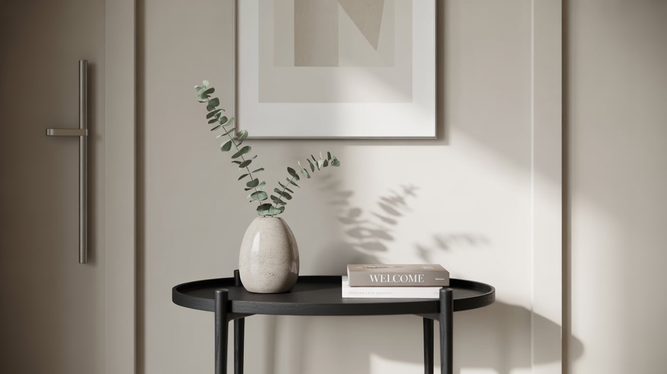
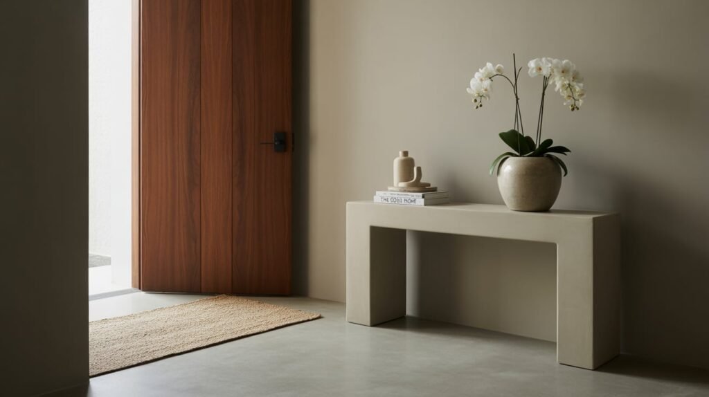
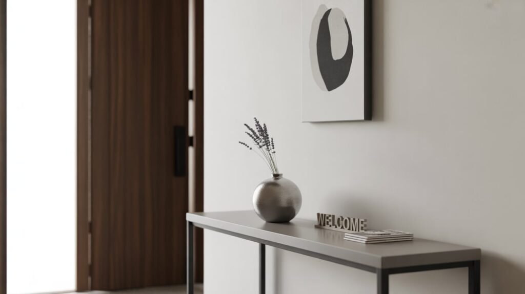
Furniture with concealed storage compartments serves double duty in minimalist entryways. A slim console table with drawers keeps surfaces clear while hiding keys, mail, and small daily items. Choose pieces with clean lines and minimal hardware to maintain the streamlined aesthetic.
Storage benches provide seating for putting on shoes while concealing items inside. Look for designs with soft-close hinges that won’t slam shut and disturb the peaceful atmosphere you’re creating. The top cushion should be removable for easy cleaning, especially if you’ll use it for sitting with outdoor shoes.
Vertical organization systems
Maximizing vertical space transforms narrow entryways by using height rather than width for storage. Tall, narrow cabinets fit into surprisingly small footprints while providing substantial storage capacity. Choose models with doors rather than open shelving to maintain the clean lines essential to minimalist design.
Grid systems mounted on walls create flexible vertical storage that you can reconfigure as needed. Add baskets, hooks, or small shelves to the grid based on current requirements. This adaptability means your storage grows with your needs without requiring new furniture purchases.
A slim ladder shelf unit provides multiple levels of storage while maintaining an open, airy feel. The angled design takes up less visual space than traditional bookcases while offering spots for baskets, plants, or decorative objects that add personality without clutter. Select one in light wood or metal to minimize visual weight.
Consider ceiling-mounted storage for seasonal items you access infrequently. A simple pulley system can lower and raise attractive baskets or bins, keeping winter scarves or summer hats completely out of the way when not needed. This solution works particularly well in entries with high ceilings where upper wall space goes unused.
Multi-functional pieces that do double duty
The best minimalist furniture serves multiple purposes, reducing the total number of pieces needed in your entry. An ottoman with internal storage provides seating, surface space for temporarily setting down bags, and hidden storage for items like umbrellas or dog leashes.
Here’s how different multi-functional pieces can transform your entryway:
Mirror with hooks: Combines checking your appearance with hanging lightweight items like scarves or bags
Console with shoe storage: Merges surface space for decorative items with hidden shoe compartments below
Coat stand with umbrella holder: Integrates two common entry needs in one slim footprint
Bench with basket storage: Offers seating plus organized storage in woven baskets underneath
Wall organizers with mail slots, key hooks, and small shelves consolidate multiple organizational needs into one unit. Choose designs where all components align vertically to minimize the horizontal space consumed. Mount at a height where you can easily reach all sections without stretching or bending uncomfortably.
A full-length mirror mounted on the back of your entry door serves its primary purpose while taking zero additional floor or wall space. Some versions include shallow storage behind the mirror for items like sunglasses or spare keys, though these work best on doors that don’t open fully against a wall.
When selecting multi-functional pieces, prioritize quality over quantity. One well-made storage bench will serve you better than multiple cheaper pieces that wear quickly and require replacement. The initial investment in durable, attractive storage pays off through years of daily use without deteriorating appearance.
The Right Lighting and Mirror Strategies
Light and reflection work together to create the illusion of expanded space in your entryway. These elements cost less than renovation but deliver dramatic results in how spacious your entry feels.
Strategic mirror placement for depth
Mirrors double visual space by reflecting your entry, but placement determines their effectiveness. Positioning a mirror directly across from your door creates depth immediately upon entering, making the space feel twice as long. This works particularly well in narrow hallways where width feels constraining.
Avoid placing mirrors where they’ll reflect clutter or unattractive views. A mirror facing a blank wall simply doubles emptiness without adding visual interest. Instead, angle mirrors to capture light sources, artwork, or architectural features worth highlighting. Even reflecting a simple plant or sculptural object creates layers of visual interest.
The size and shape of mirrors affects their space-expanding properties differently. Tall, narrow mirrors elongate spaces vertically, making ceilings appear higher. Wide, horizontal mirrors stretch spaces sideways, helpful in tight corridors. Round mirrors soften angular spaces and create focal points without the harsh edges that can make small areas feel boxed in.
Multiple small mirrors arranged as a gallery wall create rhythm and movement that draws the eye around the space. This technique prevents the static feeling that makes small entries feel constraining. Keep frames consistent in color or material to maintain minimalist cohesion while adding visual texture through repetition.
Natural light maximization techniques
Every bit of natural light that enters your space contributes to its sense of openness. If your door includes glass panels, keep them sparkling clean – even slight film or fingerprints reduce light transmission. Replace heavy curtains or coverings with sheer materials that maintain privacy while allowing light to filter through.
Light-colored flooring near the entry reflects daylight upward, brightening the entire space. If replacing flooring isn’t possible, a light-toned rug can achieve similar effects. Choose low-pile options that won’t create tripping hazards or collect debris from shoes.
Window treatments make a significant difference in light availability. Mount curtain rods close to the ceiling and extend them well beyond window frames. This technique makes windows appear larger while ensuring fabric doesn’t block light when open. During daytime, pull curtains completely back to maximize light infiltration.
Paint window sills and frames in glossy white or light colors to reflect additional light into your entry. These surfaces act as mini light bounces, directing sunlight deeper into the space. The reflective finish of gloss paint amplifies this effect compared to flat finishes.
Artificial lighting that creates openness
Layered artificial lighting prevents the flat, one-dimensional look that makes entries feel small. Start with ambient lighting from ceiling fixtures or recessed lights to provide overall illumination. Add accent lighting through wall sconces or picture lights to create depth and highlight specific areas.
Uplighting dramatically expands perceived space by illuminating ceilings and making them appear higher. Simple LED strips hidden behind crown molding or furniture create soft, indirect light that washes walls without visible fixtures. This technique works especially well in entries with interesting ceiling details worth highlighting.
The temperature and intensity of bulbs affect spatial perception significantly. Bright, cool-toned bulbs create alertness and expand space, while dim, warm bulbs create intimacy that can feel confining in small entries. Install dimmer switches to adjust lighting based on time of day and mood desired.
Track lighting offers flexibility in highlighting different areas as your needs change. Unlike fixed fixtures, track lights can be repositioned to illuminate artwork, wash walls with light, or spotlight specific zones. Choose minimal, streamlined fixtures that blend with your ceiling rather than drawing attention.
Reflective surfaces beyond mirrors
Incorporating reflective materials throughout your entry multiplies light without relying solely on mirrors. Glossy ceramic tiles for flooring or wainscoting bounce light while providing durable, easy-clean surfaces perfect for high-traffic areas.
Metallic accents in hardware, light fixtures, and accessories create subtle reflections that add sparkle without overwhelming the space. Brushed finishes provide gentler reflection than polished metals, maintaining minimalist sophistication. Brass, copper, and gold tones warm up cool spaces, while chrome and nickel enhance modern, crisp aesthetics.
Glass elements maintain sight lines while providing functional surfaces. A console table with a glass top appears to float, preserving visual flow. Glass vases, bowls, or sculptural pieces add decoration without visual weight. Frosted or textured glass provides interest while maintaining the light-transmitting properties that keep spaces open.
Lucite or acrylic furniture offers even greater transparency than glass, virtually disappearing while serving practical purposes. An acrylic umbrella stand or magazine holder provides function without adding visual clutter. These materials work particularly well in ultra-small entries where every inch counts.
High-gloss paint on doors, trim, or accent walls creates mirror-like surfaces that reflect light throughout the day. This technique works best on smooth, well-prepared surfaces where imperfections won’t be magnified. Use sparingly to avoid overwhelming the space – one glossy door or accent wall provides sufficient reflection without creating disorientation.
Color Schemes That Open Up Your Space
Color choices fundamentally alter how spacious your entryway feels, with the right palette adding perceived square footage without moving a single wall. Understanding how different schemes affect spatial perception helps you make informed decisions that support your minimalist goals.
The power of monochromatic palettes
A single color family used throughout your entry eliminates visual breaks that make spaces feel choppy and small. This doesn’t mean everything must be identical – instead, vary shades and tones within one color for depth without disruption. Light gray walls might pair with slightly darker gray doors and pale gray flooring, creating subtle variation while maintaining flow.
Monochromatic schemes reduce decision fatigue and shopping complexity too. Once you choose your base color, every addition either fits the palette or doesn’t, simplifying furniture and accessory selection. This cohesion naturally supports minimalist principles by preventing the accumulation of mismatched items.
Texture becomes crucial in monochromatic spaces to prevent monotony. Combine smooth painted walls with textured linen storage baskets, rough ceramic vessels, and soft wool rugs all in similar tones. These tactile differences add interest your eye perceives even when color remains constant.
The psychology of monochromatic spaces promotes calm and order. Your brain processes unified color schemes more easily than complex combinations, creating the mental ease associated with spaciousness. This psychological comfort translates into physical perception – when your mind feels uncrowded, spaces seem larger.
Which neutrals work best
Not all neutrals perform equally in small spaces. Pure white reflects maximum light but can feel stark or clinical without warm elements to balance it. Soft whites with warm undertones – think ivory, cream, or linen – maintain brightness while feeling more welcoming.
Gray has become the modern neutral of choice for good reason. It pairs beautifully with both warm and cool accent colors, allowing flexibility as your style evolves. Light to medium grays expand space effectively while hiding scuffs and marks better than white. Avoid charcoal or dark grays on walls, which can close in an entry despite their sophistication.
Beige and tan often get overlooked but work wonderfully in entries that receive warm natural light. These colors enhance sunlight’s golden qualities while maintaining the space-expanding properties of light tones. Modern beiges lean toward greige (gray-beige) for updated appeal without the yellow undertones that dated older beige palettes.
Soft, muted pastels function as neutrals in minimalist spaces when used with restraint. Barely-there blue, palest pink, or whisper-soft green add personality while maintaining the light, airy feeling essential for spaciousness. Keep saturation extremely low – these should read almost as neutrals with just a hint of color.
How to use accent colors sparingly
Strategic pops of color add energy without overwhelming your minimalist entry. The key lies in the 60-30-10 rule: 60% dominant neutral, 30% secondary neutral, and just 10% accent color. This proportion maintains spaciousness while preventing monotony.
Choose one accent color and repeat it in two or three places for cohesion. A navy door might echo in throw pillow on an entry bench and a small piece of artwork. This repetition creates rhythm that moves the eye through the space, enhancing flow while maintaining simplicity.
Consider where accent colors will have maximum impact with minimum coverage:
Door interior: Painting the inside of your entry door adds surprise color visible only when closed
Single furniture piece: One colored chair or ottoman provides focus without overwhelming
Artwork or textiles: Easily changed seasonally without repainting
Plant containers: Colored pots add hue while plants provide organic texture
Hardware and fixtures: Subtle way to introduce metallics or color through function
Natural materials provide accent color without seeming forced or decorative. A wooden bench in warm walnut adds brown tones, while a jute rug brings in natural tan. These organic colors feel less intrusive than painted surfaces while still breaking up monotonous neutrals.
Paint techniques that add dimension
Specialized paint applications create depth and interest without multiple colors. Tone-on-tone techniques use the same color in different finishes – matte walls with satin stripes, for instance. This subtle variation catches light differently throughout the day, creating movement and dimension.
Color blocking with very similar shades defines zones without harsh transitions. Paint the lower third of walls one shade darker than the upper portion, grounding the space while maintaining flow. This technique also allows you to use a slightly darker, more practical color where walls encounter dirty shoes and bags.
Gradual color gradients, or ombre effects, make ceilings appear to float by lightening paint as it rises. Start with your chosen neutral at floor level and gradually add white as you move upward. This advanced technique requires skill but creates dramatic spatial expansion when executed well.
An accent ceiling in a lighter shade than walls draws eyes upward and expands vertical space. This reverses the traditional approach of darker ceilings, which can feel oppressive in small entries. Keep the difference subtle – just two or three shades lighter prevents the circus-tent effect of stark white ceilings against colored walls.
Painted “architectural details” add interest without actual molding or trim. A painted rectangle on a focal wall creates the illusion of wainscoting. Painted borders near the ceiling suggest crown molding. These trompe-l’oeil effects add sophistication and dimension while maintaining smooth, easy-clean surfaces ideal for minimalist spaces.
Furniture Pieces That Actually Help
Selecting furniture for a minimalist entryway means choosing pieces that enhance rather than restrict your space. Every item should earn its footprint through both function and form, contributing to the spacious feeling you’re cultivating.
Slim profile console tables
Console tables designed for tight spaces typically measure just 10-12 inches deep, compared to standard tables at 16-20 inches. Those few inches make the difference between comfortable passage and constant sideways shuffling. Modern designs incorporate storage without adding bulk through clever engineering.
Hairpin legs or minimal metal frames keep the visual weight low, allowing sight lines to pass through rather than stopping at solid furniture sides. This transparency maintains flow even when the table holds decorative objects or daily essentials. Glass or lucite tops enhance this effect, though they require more frequent cleaning to maintain their invisible appeal.
Height matters as much as depth in entry consoles. Standard height (30-32 inches) works for most applications, but consider your specific needs. A slightly taller console (34-36 inches) provides comfortable surface for dropping keys without bending, while shorter versions (28 inches) can tuck under windows or artwork without interfering.
Some console designs attach directly to walls without legs, appearing to float. These save precious floor space while providing surfaces and storage through drawers or shelves. Installation requires finding studs or using appropriate anchors, but the payoff in saved space justifies the effort. Ensure weight limits accommodate your intended use before installation.
Floating shelves versus bulky cabinets
Traditional cabinets often overwhelm small entries, creating visual barriers that make spaces feel cramped. Floating shelves provide storage while preserving openness, allowing walls to remain visible between stored items. This breathing room prevents the closed-in feeling that full cabinets create.
The placement of floating shelves affects their impact on spatial perception. Install them at varying heights rather than uniform spacing to create visual movement. Start higher than you might initially consider – shelves at picture rail height (60-72 inches) draw eyes upward while keeping daily traffic zones clear.
Thickness of floating shelves influences their visual weight. Ultra-thin shelves (under 1 inch) nearly disappear against walls, while chunky wooden shelves (2-3 inches) make design statements. In minimalist entries, thinner generally works better unless you’re using a single substantial shelf as a focal point.
Mixed materials in floating shelves add interest without bulk. Wood shelves with invisible metal brackets combine warmth with modern minimalism. Glass shelves with minimal supports provide function while maintaining transparency. Metal mesh shelves offer industrial appeal while allowing light and air to pass through.
Bench options that don’t overwhelm
The right bench provides seating without blocking flow or creating visual obstacles. Backless designs maintain open sight lines while offering spots to sit when putting on shoes. Without backs or arms to create barriers, these benches feel more like horizontal planes than furniture pieces.
Narrow benches, sometimes called piano benches, fit against walls without protruding far into walkways. At just 14-16 inches deep, they provide adequate seating while leaving maximum floor space open. Length can vary based on available wall space, but even a 30-inch bench seats two people temporarily.
Nesting benches or stools tuck away when not needed, appearing only when extra seating is required. Look for designs where smaller pieces fit completely under larger ones, creating a single visual unit when stored. This flexibility accommodates occasional crowds without permanent furniture commitment.
Material choice affects both aesthetics and perceived weight. Natural wood in light finishes feels less imposing than dark stains. Metal frames with minimal cushions or wooden tops provide durability without bulk. Woven materials like rattan or cane add texture while maintaining visual lightness through their semi-transparent nature.
Wall-mounted folding benches offer ultimate space efficiency, lying flat against walls when not in use. Modern designs look sculptural rather than utilitarian when folded, becoming artwork between uses. Installation must support anticipated weight, but the space savings justify proper mounting hardware.
When to skip furniture entirely
Sometimes the most minimalist choice means no furniture at all. Tiny entries might function better with wall hooks and a small shelf than any freestanding pieces. This approach requires discipline but creates maximum openness.
Assessment of your actual needs versus habits helps determine furniture necessity. Track your entry use for a week: do you actually sit to put on shoes, or do you balance standing? Do surfaces collect items, or would wall hooks serve better? Honest evaluation might reveal that furniture creates more problems than it solves.
Alternatives to traditional entry furniture can fulfill needs without consuming floor space:
Wall-mounted valet hooks: Hold tomorrow’s outfit or arriving jackets
Over-door organizers: Store accessories behind closed doors
Ceiling hooks: Suspend bikes or seasonal items overhead
Built-in niches: Recessed wall storage adds function without projection
Testing the furniture-free approach costs nothing and provides valuable insight. Remove existing pieces temporarily and live without them for two weeks. You might discover that the open space brings more joy than any furniture could. If specific needs arise during the trial, address them with minimal, targeted solutions rather than comprehensive furniture suites.
The transition zone between outside and inside doesn’t always require furniture to function effectively. A simple tray on the floor for shoes and wall hooks for coats might suffice. This radical simplicity aligns perfectly with minimalist philosophy while creating maximum perceived space. Your entry becomes a breath of fresh air rather than an obstacle course, setting a peaceful tone for your entire home.
Your Gateway to Spacious Living
The transformation of a cramped entryway into an airy, welcoming space doesn’t require major renovation or significant investment. Through thoughtful application of minimalist principles – from strategic storage solutions and lighting techniques to intentional color choices and carefully selected furniture – even the smallest entry can feel remarkably spacious. These approaches work together synergistically, with each element supporting and amplifying the others to create an overall impression of openness that exceeds the sum of its parts.
Your entryway sets the emotional tone for your entire home experience, making its optimization worth the attention and effort. By implementing these strategies gradually, starting with simple changes like decluttering and adding mirrors before moving to larger modifications, you’ll discover which techniques work best for your specific space and lifestyle. The result will be an entry that not only looks and feels larger but also functions more efficiently, welcoming you home with a sense of calm spaciousness every single day.
Frequently Asked Questions
Q: Can I create a minimalist entryway if I have kids and need to store lots of items?
A: Yes, minimalist design with kids requires strategic hidden storage. Use wall-mounted cubbies with doors or baskets, assign each child a specific zone, and install hooks at their height. The key is containing items within closed storage to maintain clean lines while keeping necessities accessible.
Q: What’s the single most effective change to make a small entryway feel bigger?
A: Adding a large mirror opposite your entrance door creates immediate depth and doubles visual space. This one change often has more impact than any other single modification.
Q: Should I use dark colors anywhere in a small minimalist entryway?
A: Dark colors work best as small accents – perhaps on the inside of your door, in artwork, or in accessories. Keep walls and large surfaces light to maintain spaciousness while using dark tones sparingly for contrast and sophistication.
Q: How do I maintain a minimalist entryway when family members aren’t on board?
A: Create designated drop zones with attractive containers that make organization effortless. When systems are simple and convenient, even reluctant family members naturally comply. Regular five-minute resets also prevent accumulation.
Q: What flooring works best for a minimalist entryway that feels spacious?
A: Light-colored, continuous flooring that flows from your entry into adjacent rooms creates seamless visual expansion. Avoid patterns or borders that create boundaries. Large-format tiles or wide planks reduce visual breaks compared to smaller materials.
Q: Can I incorporate personal style into a minimalist entryway?
A: Absolutely. Choose one or two meaningful pieces – perhaps a piece of artwork or a unique mirror – that reflect your personality. The minimalist approach means being selective rather than eliminating personality entirely.
Q: What’s the ideal ceiling light fixture for a small minimalist entryway?
A: Flush-mount or semi-flush fixtures that hug the ceiling maintain maximum height clearance. Choose designs with upward-facing light that illuminates the ceiling, making it appear higher. Avoid hanging pendants that create visual barriers.
Q: How many items should be visible in a truly minimalist entryway?
A: Aim for 3-5 carefully chosen visible items maximum. This might include a mirror, a small plant, and a decorative bowl for keys. Everything else should have designated hidden storage to maintain visual calm.